New here. Please excuse the poor etiquette.
Been a long-time lurker on the telegram group.
I submitted this there and it was suggested I add here for the larger community to see.
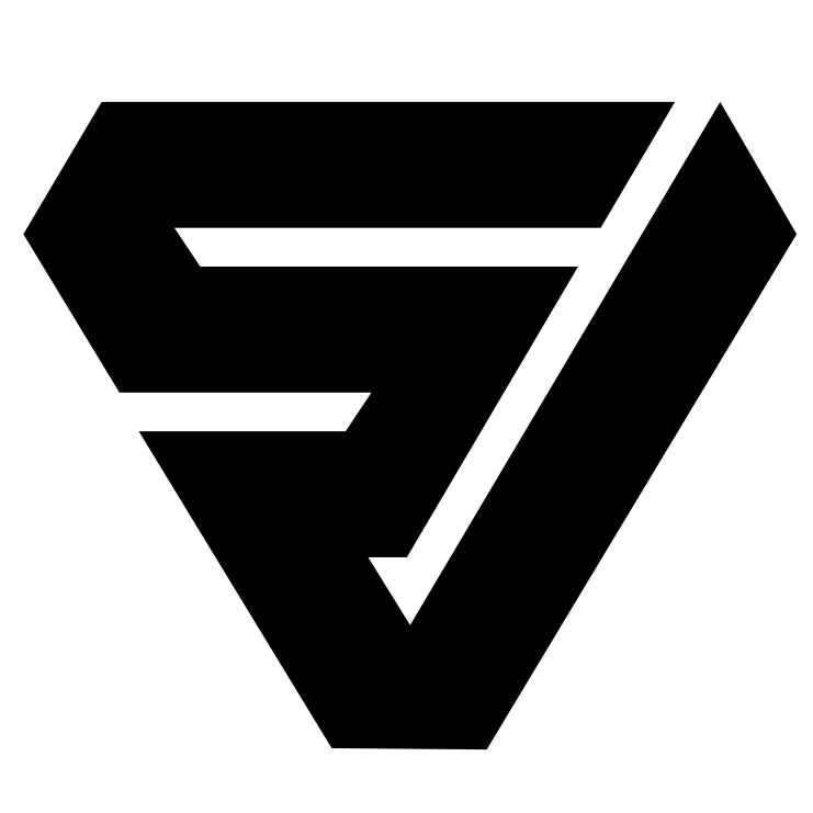
With today’s revamp. I was hoping to see a new logo. As a graphic artist with a precise engineer-oriented/drafting background, the original Sovryn logo always struck me as a little unprofessional…
V is over-weighted…seems more important than the S
No consistency of gap widths
No consistency of angles
So I spent a few hours fixing it.
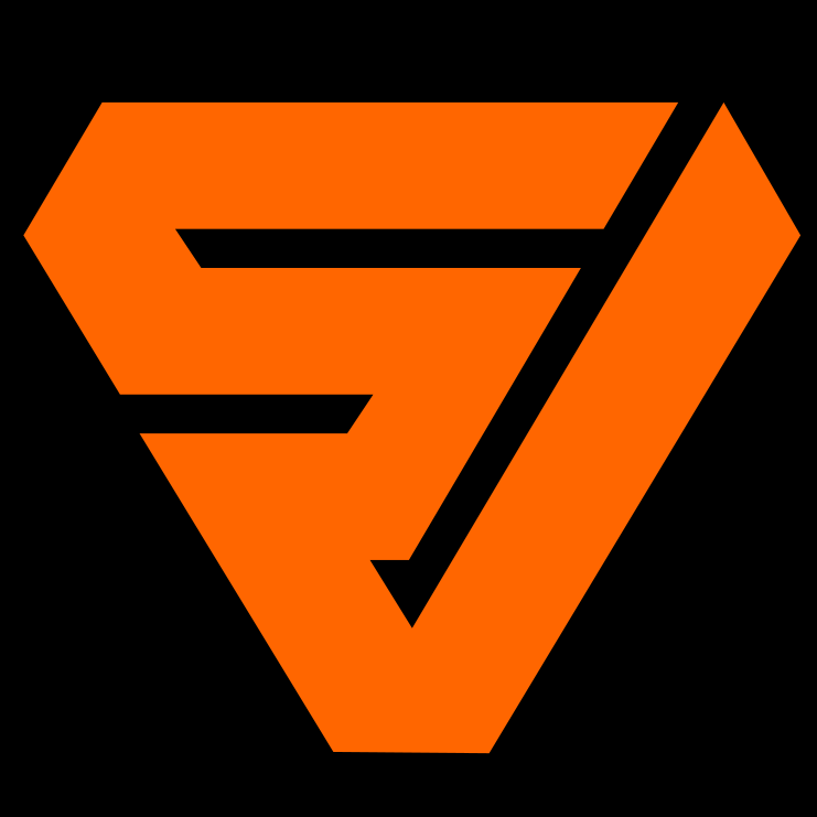
Two designs…
Blunted triangle (my preference - seems more superhero-like to me)
Pointed triangle (closer to original)
Biggest downside I see: Shitcoiners may put on conspiracy hats and claim there is a pedo connection. I’ll dispel that right out of the gate by saying…
No, just good design;
As a proud conspiracy theorist myself, I’m able understand the resemblance precisely because I regularly cite the FBI report on the subject, i.e., I’m an enemy of the pedo elite.
With that, I humbly submit these two logo possibilities and, if one of them goes over well, I’ll be happy to send an original SVG (vector) file to whoever should have it.
I’ve always like the original logo, has the right vibe I think. It’s also really easy to see/read. An “S” and a “V” SoV. Not to be nitpicky, but I feel like I’m a super average person with zero marketing experience, or graphic design training, I see an “S” with a “Check Mark” not a “V” at all. Like we’re checking off the S somehow. Maybe that adds something to your next iteration @calebeaton thanks my guy!
Looking at your suggestions I see a strong and easy to grasp brand. Particularly, the blunted edges make the logo very smooth. For instance, I can well imagine this logo to be on the backside of a coin. I would love it to become the next Sovryn logo.
I really like your enthusiasm. Given that some do like your version more than the re-brand and some don’t…what keeps puzzling me is my perceived lack of executable engagement emanating from the core team. I am in other communities and the frequency and speed of demonstrably executing feedback from the community is on an order of magnitude higher than in this one here. Needed to say that without judgement - just a sharp observation.
So, why would we aka the CMO of Sovryn, NOT run a formal vote here on the Forum?
Define the parameters e.g. give it 30 days, advertise it on TG and Twitter, define a quorum e.g. 100 or 1000 votes/wallets minimum (*out of the seemingly never surpassing 46.9K twitter accounts) and whether the ‘winner’ needs to have X% distance to the second runner up.
I encourage you to engage us all somewhere between random TG ideas and an on-chain SIP. I am asking the team specifically: why would you not let the community decide on an alternative logo? Pride? Sunk cost? Are we a DAO or do we play decentralization theatre…???
We are the people who you expect to do a lot of the organic marketing. Would you not want to know which logo version fires up the majority?
FYI - I know we had a lot of engagement on the re-branding, I appreciate that I was asked for feedback, and I gave some.
Yet, this is about a different kind of feedback: community-originated ideas vs. those of the core team.